Introducing CIO Dashboards for Choreo: A Bird's-Eye View into Your Organization

- Tishan Dahanayakage
- Senior Technical Lead, WSO2 Inc.

Photo by Chris Benson on Unsplash
We’re thrilled to announce the launch of our highly anticipated Chief Information Officer (CIO) Dashboards for Choreo. These are designed to offer CIOs a 360-degree view of their organization's engineering efficiency, operational performance, and innovational performance, all in one sleek and intuitive interface. With real-time data and powerful visualizations, our dashboards provide CIOs with the insights needed to make informed decisions and ensure that their organization is on the path to success.
Get a Head Start with DORA Metrics
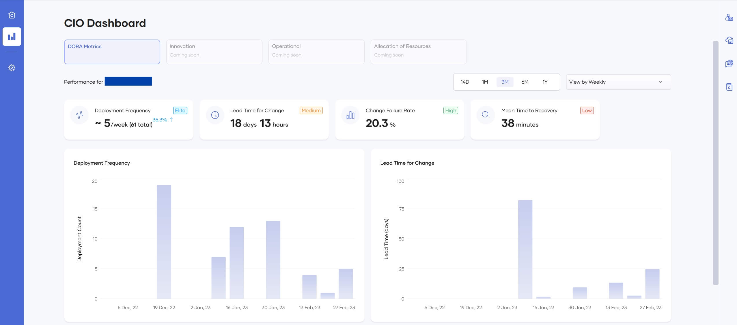
Figure 1: CIO Dashboard - DORA Metrics View
Our first offering of the CIO Dashboards is based on the DevOps Research and Assessment (DORA) metrics, which focus on measuring engineering efficiency.
The DORA team identified four key metrics to be used as KPIs to measure the performance of software development teams. These metrics have since then been regarded as crucial when measuring team performance. They are:
- Deployment frequency - How often an organization successfully releases to production.
- Lead time for changes - The amount of time it takes a commit to get into production.
- Change failure rate - The percentage of deployments causing a failure in production.
- Time to restore service - How long it takes an organization to recover from a failure in production.
By tracking these metrics, you can gain valuable insights into your team's performance and identify areas for improvement. The first two metrics indicate the efficiency of processes in place and team velocity while the last two metrics provide an indication on stability.
Stay Ahead of Your Competition with Operational Analytics
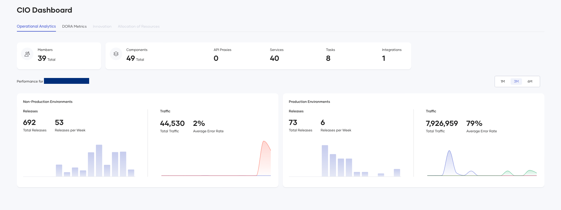
Figure 2 - Operational analytics dashboard
In addition to DORA metrics, we are offering an Operational Analytics dashboard for your organization, as seen in Figure 2.
With this dashboard, you'll have access to comprehensive insights on your current member count and the number of deployed components, broken down by categories.
But that's not all – our dashboard also provides detailed release and traffic details for both production and non-production environments, along with timely trends that give you a near real-time view of your organization's operational performance. Whether you're a CIO looking for key insights or a manager looking in to dig deeper into the data, our Operational Analytics Dashboard has everything you need to make informed decisions and drive your organization forward.
What Does This Mean for Decision-Making?
By having factual data on your engineering efficiency, you can make data-driven decisions with confidence. For example, if you notice that your deployment frequency is lower than industry standards, you can focus on improving your automation processes to increase efficiency in the release process. Similarly, if your lead time for changes is longer than expected, you can identify the bottlenecks and make the necessary changes to streamline your workflows so that developers can bring the committed code to production sooner. This will include introducing lean change review processes and reducing manual testing times.
Moreover, Choreo’s CIO Dashboards help you identify areas for improvement before they become critical issues. For example, if you see an increase in your change failure rate, you can investigate the issue and make the necessary changes before it impacts your customers or team morale.
You can also use the same dashboards to measure the effectiveness of the improvements introduced. For example, if your organization introduces an end-to-end test pipeline to tackle increased change failure rates, these dashboards can clearly show the before and after trend of the change failure rate and paint a clear picture on the effectiveness of proposed changes.
The Operational Analytics dashboard will serve as the baseline to measure how the decisions and changes mentioned above affect the operational performance of your organization. For example, questions like 'How's the traffic to my APIs and services? Is there an improvement over time or vice versa?' can be answered at a glance. This, in turn, helps you kickstart action plans to address your concerns.
In simple terms, decision-making will be easier with up-to-date figures and illustrations!
How to Get Started
Our CIO dashboards will be generally available for every organization signed up for Choreo. Login to the Choreo Console and navigate to CIO Dashboards through the left-hand panel to try them out. By default, deployment frequency and lead time for change will be enabled for your organization and statistics will be visible if you have made any production deployments. Visit our documentation to configure and enable the other two metrics.
What’s in Store for the Future?
We believe that having a holistic understanding of your organizational performance is critical to your success. By providing CIOs with a dashboard that visualizes key metrics in near real-time, you can make informed decisions that drive your business forward and significantly reduce the go-to-market time.
We’re excited to roll out Choreo’s CIO Dashboards to our customers, and look forward to continuing to improve them with additional innovative performance metrics such as commit count, PR count, incident count, commits over time, etc. Stay tuned for more updates and enhancements!