Introducing Custom Theme Support for the Choreo Developer Portal

- Janaka Sandaruwan
- Senior Software Engineer, WSO2

Photo by Pawel Czerwinski on Unsplash
Introduction
The Choreo developer portal makes it easier for API consumers to find and connect to thousands of APIs. Typically, an application developer who may be internal or external to your organization would want to consume the APIs published in the developer portal to develop their applications.
A theme consisting of logos, images, a color scheme, layout, style elements, etc. will contribute to the overall look and feel of a website. Therefore, a theme directly reflects your brand identity and represents who you are to your partners and customers.
Use Case
The Choreo developer portal comes with a default theme, which defines the basic look and feel of the developer portal. Since the capability to customize an API portal with your corporate logos and styles is crucial to show your brand identity to your stakeholders, Choreo allows you to customize the look and feel of the developer portal depending on your preference.
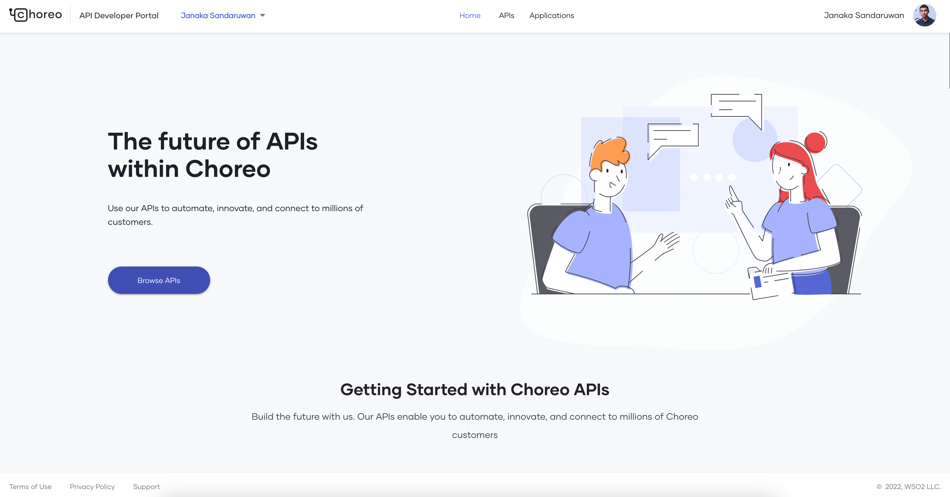
Figure 1 - Default theme of the developer portal
How it Works
As shown in Figure 1, the developer portal maintains a central stylesheet to apply the default theme. The application utilizes MUI Theme Provider to apply the styles in the central stylesheet to all the components in the developer portal frontend application. Once a customer configures a custom theme from the Choreo Console, the developer portal fetches the modified theme from the backend when someone visits the customer’s organization in the developer portal. Then it replaces the styles fetched from the backend with the styles in the central stylesheet.
How to Change the Theme
Let’s discuss how to customize our developer portal.
Navigate to Settings on the top right corner of the Choreo Console and then click on the API Management tab. Then, navigate to the Devportal Theme tab. This tab is only visible to admins in the organization.
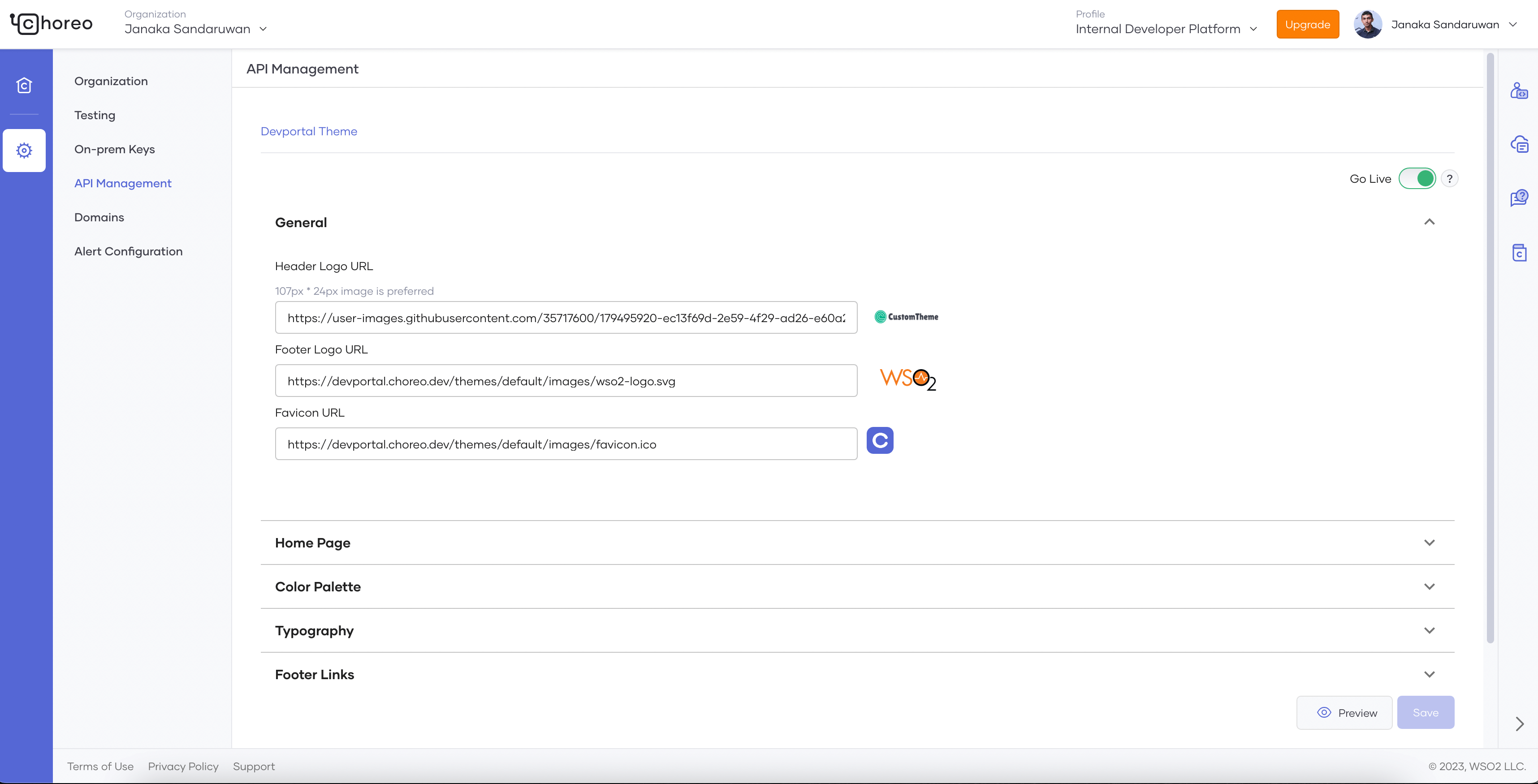
Figure 2: Theme preferences menu in Choreo Console
As shown in Figure 2, in the General section, you can specify URLs for the header and footer. The Home Page section is used to change the titles and the banner of the developer portal home page. You can set the background, text, and button colors through the Color Palette section. The colors are then applied to the developer portal as seen in Figure 3. The Typography section specifies the fonts for the text in the developer portal. You can specify URLs for the footer links in the Footer Links section. You can also preview the changes by clicking on the Preview button.
Once you have completed the changes, you can save them and enable them by clicking the Go Live button.
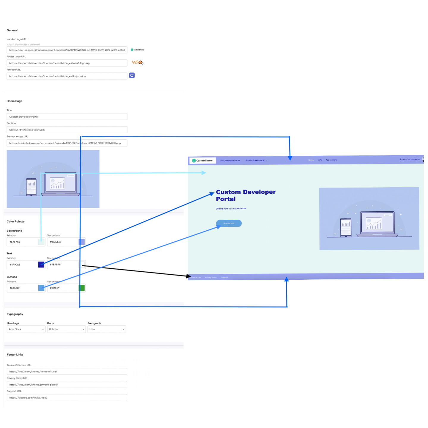
Figure 3: How colors are applied in the devportal
Congratulations, you have successfully customized your developer portal. It will now look similar to Figure 4.
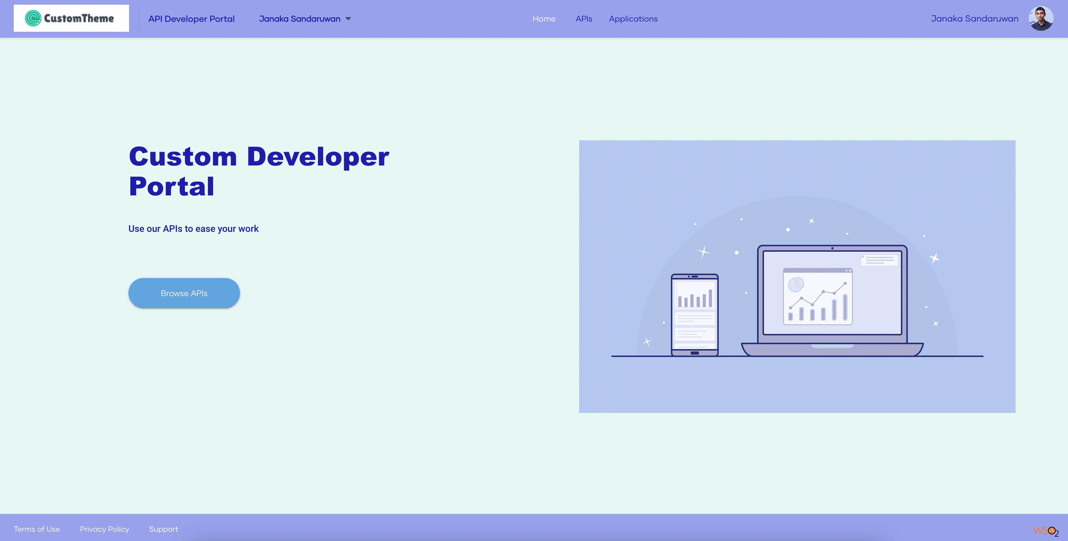
Figure 4: Customized devportal theme
Would you like to add your own custom theme? Try it yourself by signing up to Choreo today!

