View DORA metrics
DORA metrics comprises of four key metrics. In this documentation we will explore what each metric represents in Choreo. Choreo displays a summary and a graph of each metric.
Snapshot view

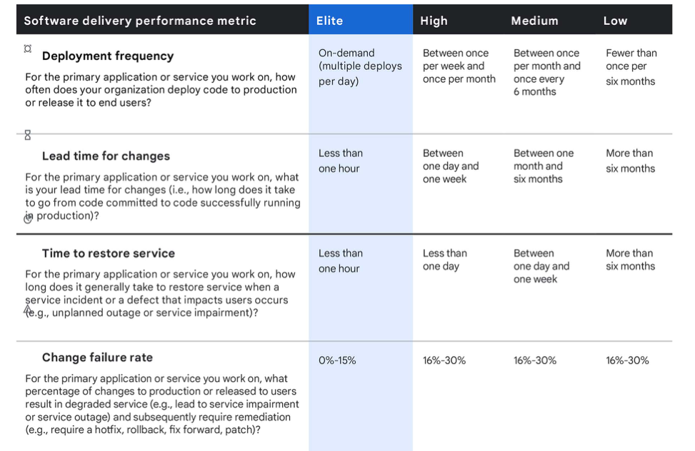
The snapshot view includes four tiles on the top of the dashboard that shows a summary of the DORA metrics for the entire time period you select. The snapshot view categorizes each metric into four categories based on performance; elite, high, medium, and low. The below matrix shows the categorization based on the 2020 DORA metric report.
Time series view
Time series view gives the user a graphical representation of how the statistics changed over a period of time. You can use this view to get a detailed understanding about how the teams have performed and also identify timely trends.
Deployment frequency
DORA team definition: How often an organization successfully releases to production.
In the context of Choreo, this translates to the number of times an organization deploys a component to the production environment. Choreo will not count the deployment done to the development or any other lower level environments.
Snapshot view
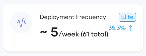
The snapshot view of the Deployment Frequency metric shows the deployment frequency of all components belonging to the organization selected in the organization dropdown. The unit for deployment frequency is determined dynamically and Choreo rounds the measurement to the nearest. For example, if there are more than one deployments daily, the deployment frequency is measured in deployments per day. If the deployment frequency is less, it is measured in a higher granularity. For example, deployments per week.
Lower deployment frequency suggests that your organizational efficiency is low and that you need to evaluate and improve the processes to encourage frequent releases.
Apart from that, Choreo will also show the total number of deployments for the selected time range and percentage increase or decrease compared to previous selected time range.
Time series view
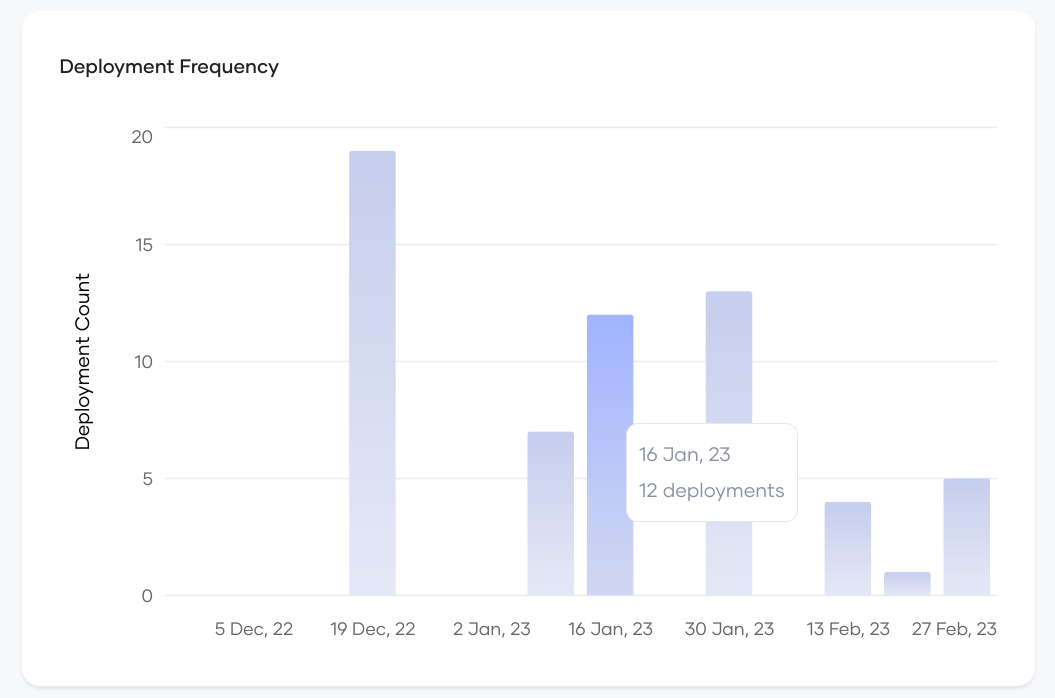
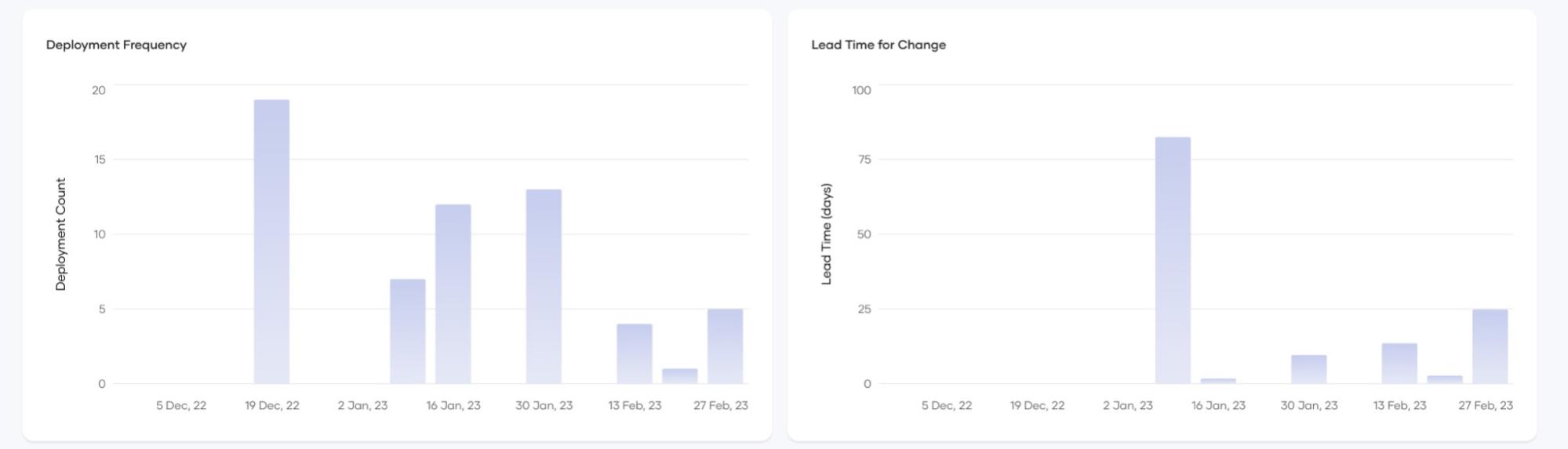
The time series view for Deployment Frequency metric visualizes the deployment count as a bar chart for the selected time period. Deployment count is aggregated based on the ‘view by’ selector. Hovering over each bar, shows the counts for the aggregated period.
Using this chart, organizations can identify deployments patterns, such as, days of week/months of year where more deployments are likely to happen (near quarterly release days) and periods with less deployments. Decision makers can then take steps to investigate and improve performance.
Also you can use it to measure the team performance after a significant process change. This chart will clearly show the pattern before and after the process change.
Lead Time for Change
DORA team definition: The amount of time it takes a commit to get into production.
In the context of Choreo, this translates into the time between committing and promoting a deployment to production. This approach may miss any commits you put to production between two commits. However, the purpose of this metric is to identify the efficiency of the review, approval, and CI/CD processes. Hence looking at the production commit will be adequate. If a team is committing locally for a lengthy period of time without deploying into production, it will reflect in the ‘Deployment Frequency’ charts.
Snapshot view
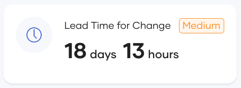
The snapshot view of this metric shows the 95th percentile of the lead time for the selected time period. 95th percentile will serve as a better representation as it takes out any large outliers which can taint the average value. Lower lead times for change suggests that your organization has efficient processes for change review, approval, and CI/CD, while longer times suggests that the process needs to improve. Organizations can also use the categorization label to know your organization standpoint in global standards.
Additionally, Choreo will also show the percentage increase or decrease compared to last time period.
Time series view
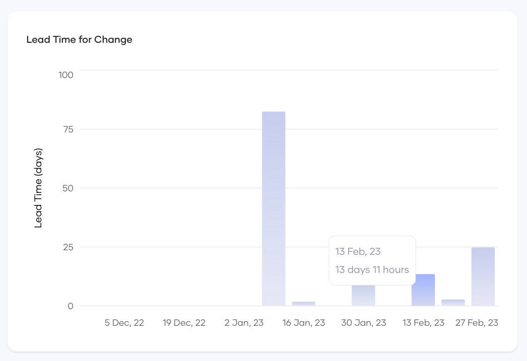
The time series view of this metric visualizes the lead time as a bar chart for the selected time period. The time is summed based on the ‘view by’ selector. To handle outliers, the y axis will employ a log scale to represent all values read dynamically. Hovering over each bar will provide you with actual counts for the aggregated period. Using this chart, organizations can identify timely trends in their release process. For example, organizations will be able to identify the time of year where lead time rises, for example, summer break. Also organizations can use this to benchmark and evaluate new process changes. For example, if you introduced a process to include peer programming and reviewing, this chart can be used to evaluate its effect on the lead time and provide leadership with factual information to proceed further.
Change failure rate
The DORA team definition: The percentage of deployments causing a failure in production.
In the context of Choreo, this translates to a ratio between the number of deployments that have caused failures in the production environment affecting end users and the total deployment count. If there is at least one incident reported against a deployment, Choreo will consider that deployment as a failed deployment in production. Any deployment-time failures will not be counted as production failures as it doesn't impact the end user. For this metric to be accurate, the organization is expected to open incidents adhering to the proper format as it is crucial for Choreo to identify production failures.
Snapshot view
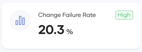
The snapshot view of this metric visualizes the change failure rate as a percentage for the selected time period. This will be the absolute percentage for the entire time period. When deciding the time, time of deployment is considered instead of the incident reported time. For example, change failure rate for January 2023 will reflect the following: - All deployments that happened within January. - Any incidents that were reported at anytime (in or after January) against the January deployments.
Using this view, the leadership can get a measurement about the quality of their deliverables. Higher rates suggest organizations will need to improve their processes to bring in more quality assurance aspects such as improved code coverage and end-to-end test coverage.
Additionally, Choreo will also show the percentage increase or decrease compared to last time period.
Time series view
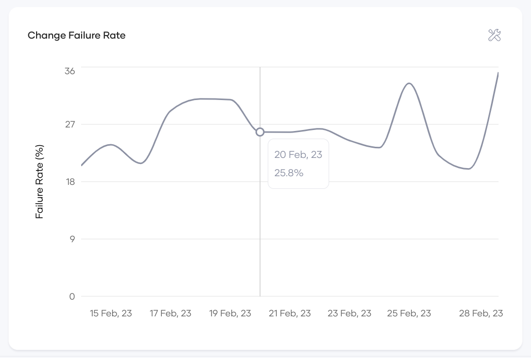
The time series view of this metric shows it as a line chart with data points corresponding to the granularity selected by the ‘view by’ selector. Absolute percentage is shown for each granularity. Hovering over the line chart will provide you with actual counts for the aggregated period. Using this chart, the leadership can identify timely trends in product quality aspects. For example, this view will show the months of year where failure rate is high(for example, close to quarterly release/announcement dates). Also, you can use this to measure the effectiveness of changes introduced to improve quality. For example, if the organization introduced an end-to-end test pipeline integration to the PR approval process, they can use this view to factually observe the timely impact of that change and determine how it decreases the failure rate .
Mean Time to Recover(MTTR)
The DORA team definition: How long it takes an organization to recover from a failure in production.
In the context of Choreo, this is the time between identifying a production incident and resolving it. This metric will reflect how fast and agile teams respond to identify and resolve incidents.
Choreo depends on the open and close times of incidents to gather the relevant information. Hence for the dashboards to be accurate, organizations must adhere to follow processes to update and close incident tickets efficiently in their incident management system.
Snapshot view
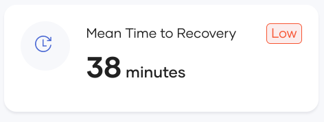
The snapshot view for this metric illustrates the mean recovery time for the selected time period. Choreo dynamically adjusts the time unit to measure this metric for better readability. Using this chart, organizations can evaluate the response time and agility of their incident handling teams which in turn is an indication of stability. Higher MTTR means the leadership should look at new ways of improving efficiency and agility of teams in handling incidents.
Time series view
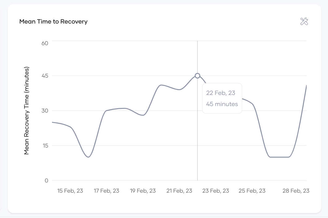
The time series view of this metric shows how the mean time to recovery changed over time on a granularity based on ‘view by’ selector. Each time the granularity mean would be used as the aggregation factor. Hovering over line chart will provide you with actual counts for the aggregated period.
Using this view, the leadership can learn timely trends on mean time to recovery, such as, higher values during holiday periods when there is less staff. Also you can use this measurement to evaluate effectiveness of process changes such as introducing an incident response plan. The trend view will clearly show the before and after statistics and effectiveness of the process change.